Butterfly Brilliance - Colour Combo Blog Hop
Hello and welcome to another Colour Combo Blog Hop. If you have hopped over from Nigezza Creates or are joining the hop here with me, we have another fabulous colour combo this month!
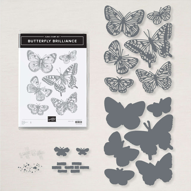
I am using this lovely bundle a lot, in fact I used for my project for the colour combo blog hop last month too!
Here is my project:
You will need:
14.5 cm x 21 cm Basic White Thick (BWT) scored at 10.5 cm
10 cm x 14 cm BWT
10 cm x 3 cm BWT
Basic Black for die cutting
The background:
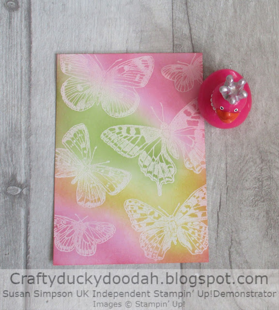
I always use my embossing buddy before heat embossing. The butterflies have been stamped with Versamark ink and then heat embossed with white embossing powder.
I then used my blending brushes to add the colour combo ink colours. Cherry Cobbler is an intense colour so I dabbed it off (a lot) before blending as I did not want it to overpower the other combo colours. I love how the three colours have merged in areas to create new colours.
Top Tip #1
I dab ink from my blending brushes onto one of my Stamparatus plates. This way you don't waste the ink. So, instead of dabbing the brush in the ink pad to re ink, you dab the Stamparatus plate instead.
Top Tip #2
Once you are happy with the inked panel, take a piece of tissue and rub over the embossed butterflies. Doing this will remove any ink from the embossed images and brighten up the white embossing.
The diecutting:
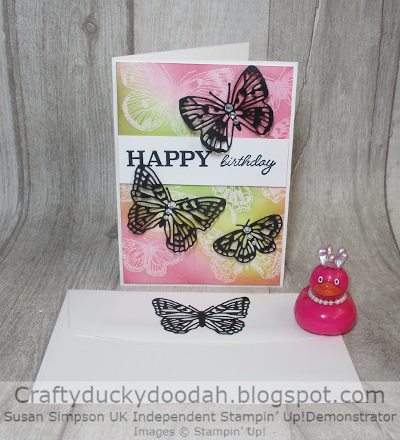
I cut out five different butterflies using black card stock.
To assemble:
Adhere the embossed panel to the front of the card using dimensionals.
The sentiment:
I stamped the sentiment (from a stamp set called So Much Happy) with Memento ink and then adhered the panel across the front of my card with dimensionals.
Curl and shape the wings of the butterflies and adhere to the card front using dabs of Tombow on just the body of each butterfly. I then added a trio of gems using 3 different sizes to accent the centre of each butterfly.
The inside/envelope:
I used the remaining die cut butterflies to decorate the inside of the card and the envelope flap adhering them with dabs of Tombow.
Unusually for me, I even added some jewels on the inside of my project - I must have been feeling extravagant!
The completed card and envelope:
I was a little worried when I saw the colour combo and was quite pleased that I managed to tone down the Cherry Cobbler ink. This pretty card would look lovely in lots of different colour combos too.
I do like the challenge of a colour combo - I would not have put these colours together but I am quite pleased with the result!
Next up is Angela Köber who has another great colour combo project to share with us.
Susan xx
Thank you so much for looking at my Blog today. Unfortunately I am no longer a Stampin' Up! Demonstrator. SU regulations are very strict; I have to wait 3 whole months before I can rejoin again.
If you would like a copy of either of the current Annual Catalogue or the current Mini Catalogue let me know and I will arrange for one to be popped in the post for you. The new Annual Catalogue will also be available soon, let me know if you would like my friend to send you a copy.










Absolutely stunning. So striking xx
ReplyDeleteThank you Vickie xx
DeleteHello Susan,
ReplyDeleteYour card is really great !!! Thank you very much for the inspiration.
Many greetings from Leipzig.
Rene
Thank you Rene.
Deletegorgeous card I really must play with my set
ReplyDeleteThanks Sue, yes you must!!
DeleteLovely card Susan, love the embossed resist background x
ReplyDeleteThanks Mo, I do love heat embossing even after all these years! xx
DeleteBeautiful card Sue. Thanks for the tip about the Stamparatus plate.
ReplyDeleteThanks Linda.
DeleteBeautiful card & great tips :-)
ReplyDelete